Dark Mood: A Distinctive Display Font for Digital Design
As a UI designer who builds landing pages, SaaS dashboards, and boutique e-commerce experiences, I treat typography like architecture—it shapes how users move through a screen, where they pause, and what they remember. Dark Mood is one of those rare display fonts that doesn’t just sit on the page; it sets tone, signals intent, and holds attention without sacrificing clarity.
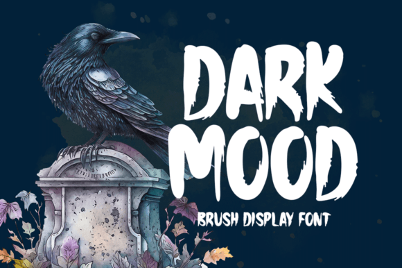
Visually, Dark Mood walks a thoughtful line between expressive and controlled. It’s not a script font, nor a rigid geometric sans serif—instead, it features subtly uneven stroke contrast, gently tapered terminals, and a quiet asymmetry in its letterforms. That “quirky” quality mentioned in its description isn’t gimmicky; it’s intentional character. Letters like g, q, and R carry nuanced personality without compromising legibility at scale. On high-resolution screens or retina displays, its details resolve cleanly—no blurring, no pixelation—even at 48px and above.
In practice, Dark Mood excels where hierarchy and voice matter most: hero section headlines, product name treatments, course title cards, and branded banner graphics. I’ve used it for a wellness coaching site’s headline (“Your Calm Starts Here”) over a muted gradient background—and the contrast between its grounded rhythm and the soft visual field created immediate emotional resonance. It worked because Dark Mood supports scanning behavior: users didn’t need to read slowly to grasp meaning. The shape of the letters guided the eye naturally left-to-right, even with tight line spacing.
It’s not built for body copy—and shouldn’t be. As a display font, its strength lies in short, high-impact phrases: “Limited Edition,” “Launch Day,” “New Collection,” or “Join the Waitlist.” On mobile, I use it exclusively for H1s and key CTA overlays—never below 32px, and always with at least 1.2x line height to preserve breathing room. Over dark backgrounds, I apply subtle text shadow (1px black at 30% opacity) to ensure edge definition. Over light images, I pair it with a semi-transparent overlay or use a crisp white fill with minimal tracking adjustment.
For brand consistency, Dark Mood anchors tone without overwhelming. A creative portfolio site used it for project titles alongside Inter Sans for descriptions—clean, confident, and quietly distinctive. An indie online store selling ceramic goods paired it with Lora (a warm serif) for product blurbs, letting Dark Mood handle the “Hand-Thrown | Small Batch” banners while Lora handled storytelling. That pairing works because Dark Mood has enough presence to hold its own—but not so much that it competes with supporting type.
When building conversion-focused layouts, I place Dark Mood where intention needs amplification: above sticky CTAs, inside testimonial highlights (“Real Results, Real People”), or as animated entry text in hero sections. Its rhythm encourages pause—not hesitation. Users don’t stumble over the letters; they lean in. That subtle psychological nudge matters most on pricing pages or limited-time offers, where tone reinforces urgency without shouting.
Readability across devices remains reliable, provided you respect its role. On small buttons (<44px tall), I avoid it entirely—opting instead for a neutral sans serif. But for large-format banners in email headers or social media ads exported from Figma, Dark Mood delivers sharp, scalable impact. Its vector-based outlines render crisply at any size, and the included WOFF2 files load efficiently—critical for Core Web Vitals. If your project requires multilingual support, verify coverage: the standard release includes Latin-1 and basic Latin Extended-A, covering English, Spanish, French, German, and Portuguese—ideal for most global-facing digital products.
Licensing is straightforward but essential to address early. Dark Mood is a commercial font, and its license covers web embedding via @font-face, usage in client websites, SaaS platforms, digital templates, and online stores—as long as you’re using it within the scope of your purchased license tier. For agencies or studios deploying across multiple client projects, the extended license removes per-site restrictions and includes access to stylistic alternates (like a tighter-width variant for narrow hero containers or an all-caps version for logo lockups). Always check the vendor’s terms before bundling it into a theme or design system.
Pairing strategy matters more than ever with expressive display fonts. My go-to combinations:
- Sans serif base: Use Inter, Manrope, or IBM Plex Sans for all body copy, form labels, navigation, and captions. Their neutrality lets Dark Mood shine without visual fatigue.
- Serif counterpoint: Try Cormorant Garamond or Playfair Display for editorial contexts—blog headers, case study intros, or newsletter subject lines—where you want layered sophistication.
- Avoid pairing with other display fonts, especially scripts or heavy grotesques. Dark Mood’s personality is strong enough to stand alone in its role.
In responsive layouts, I declare Dark Mood only for viewport widths ≥768px—switching to a system font stack on smaller screens to prioritize performance and readability. That’s not a limitation; it’s smart typography hygiene. The font’s value isn’t in ubiquity—it’s in precision placement.
Whether you're refining a brand kit for a digital product, designing a course sales page that balances warmth and authority, or crafting a one-page app landing experience, Dark Mood serves as both punctuation and personality. It doesn’t try to be everything—it’s a focused tool for moments that demand distinction. And in a landscape crowded with generic sans serifs and overused display fonts, that kind of intentionality is rare. When used with purpose—not decoration—it strengthens trust, clarifies message, and makes digital space feel unmistakably human.